Print Design, Web Design, Information Design, & Environmental Design
Barcoding Brand Refresh & Bank Street Signage
About the Project
Barcoding, Inc., is a supply chain automation and innovation company impacting tens of thousands of organizations across the globe, helping businesses increase revenue, reduce operational costs and improve their customers’ experiences through our core expertise areas: data capture, labeling and printing, and mobile computing solutions. Our organization has grown and evolved in its 20-year history, adding new areas of business as technology changes, but the visual identity for Barcoding had not adapted to reflect these changes, still using a barcode as its primary brandmark.
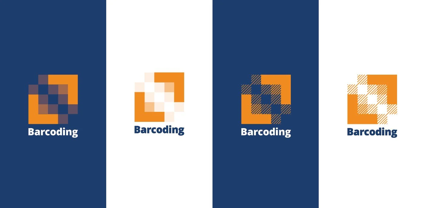
On the 20-year anniversary, our in-house design department decided to take on the task of refreshing our brand to better reflect us as a solution provider, while still giving a nod to our history and building on the equity of our name. On January 9, 2019, we launched a new mark that represents the solutions we build together with our customers and partners, no matter what the future of technology holds. The mark represents the importance of every small building block (whether a piece of data, a team member, or a process) in creating something meaningful. The new branding for Barcoding represents our endless possibilities! As part of the brand launch, we developed a much more comprehensive design system for the organization that is more flexible and adaptable to various mediums.
Creating an Effective Roll-Out & Making Our Brand Successful
by Jennifer Marin Jericho
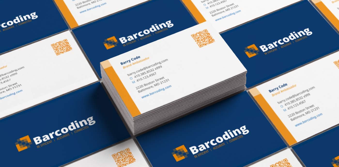
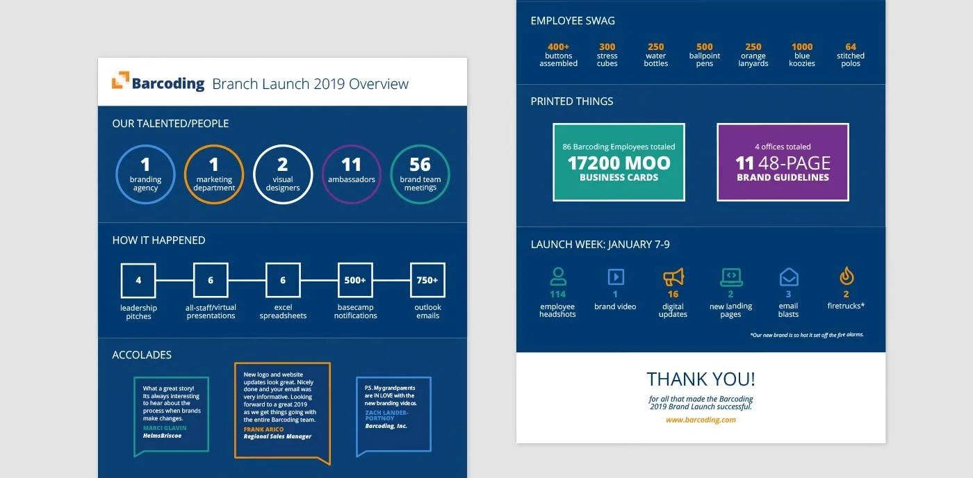
To ensure an effective roll-out, we recruited brand ambassadors spanning all areas of business, covering every touchpoint with customers, partners, and prospects. The team consisted of members from logistics, finance, sales, information technology, engineering, and product development; in addition to our marketing and design team. Our launch date would be in the week of our sales kick-off when all employees would be in Baltimore.
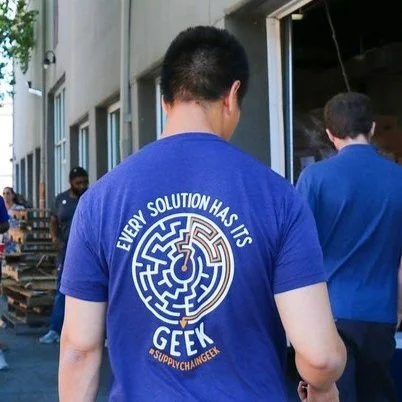
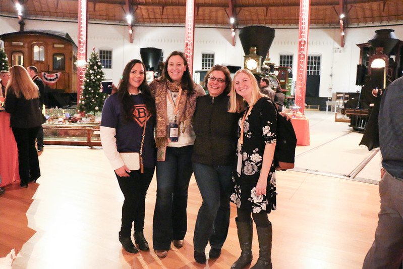
Some featured #SupplyChainGeeks
Our first step was to train the ambassadors on how to use the new visual identity while listening to their questions and adapting the materials based on their feedback. We needed to have enough components in place for all areas of the business to power up new materials with ease. It was important that the organization absorb the new identity without it interrupting everyday operations.
The second component of the roll-out was building energy around launch day across the organization. Ambassadors helped us with event logistics and planning the internal launch party, which included some of our premium strategic partners. Marketing and design developed the new materials that would enable our various teams to kick off the new year with a brand-new look and create a conversation starter for our sales team.
Extending the Brand
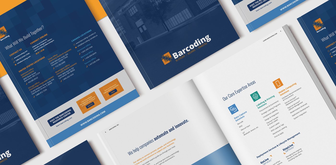
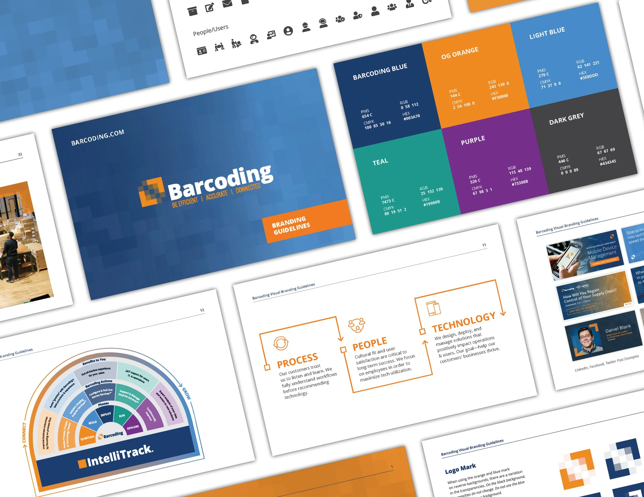
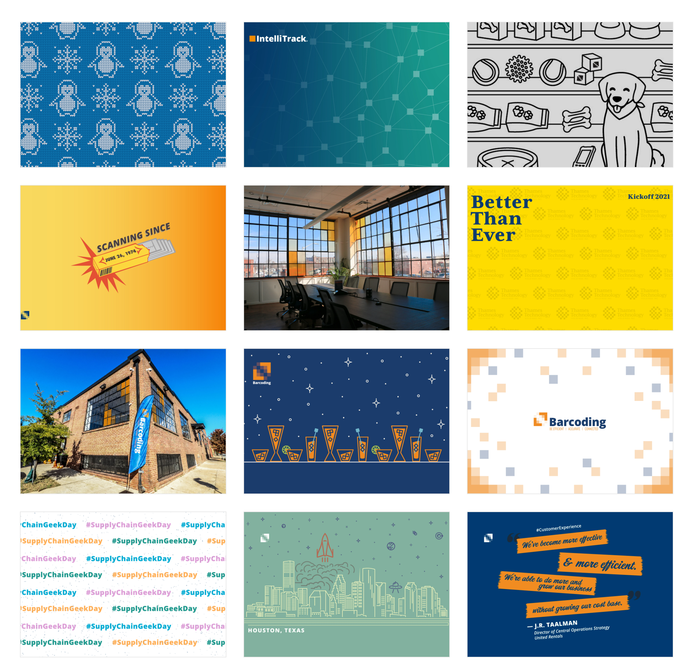
Since the brand launch, the Barcoding brand identity has expanded into a variety of different deliverables in a variety of spaces (in-person and digital). One of our digital campaigns was to empower our people to share the Barcoding story. We did this in many ways such as through the brand hero newsletter, various fun initiatives (wallpaper backgrounds and gifs), and innovative swag (lego geeks, t-shirts, stickers, etc.). The brand guide continues to be updated every quarter with new brand updates.
A sampling of the brand guidelines
Brand Hero Newsletter for employees
Barcoding HQ Signage
In the fall of 2020, we embarked on a building branding project for Barcoding's HQ in Baltimore. Since it was a year after we moved in, it was time to install some signage.
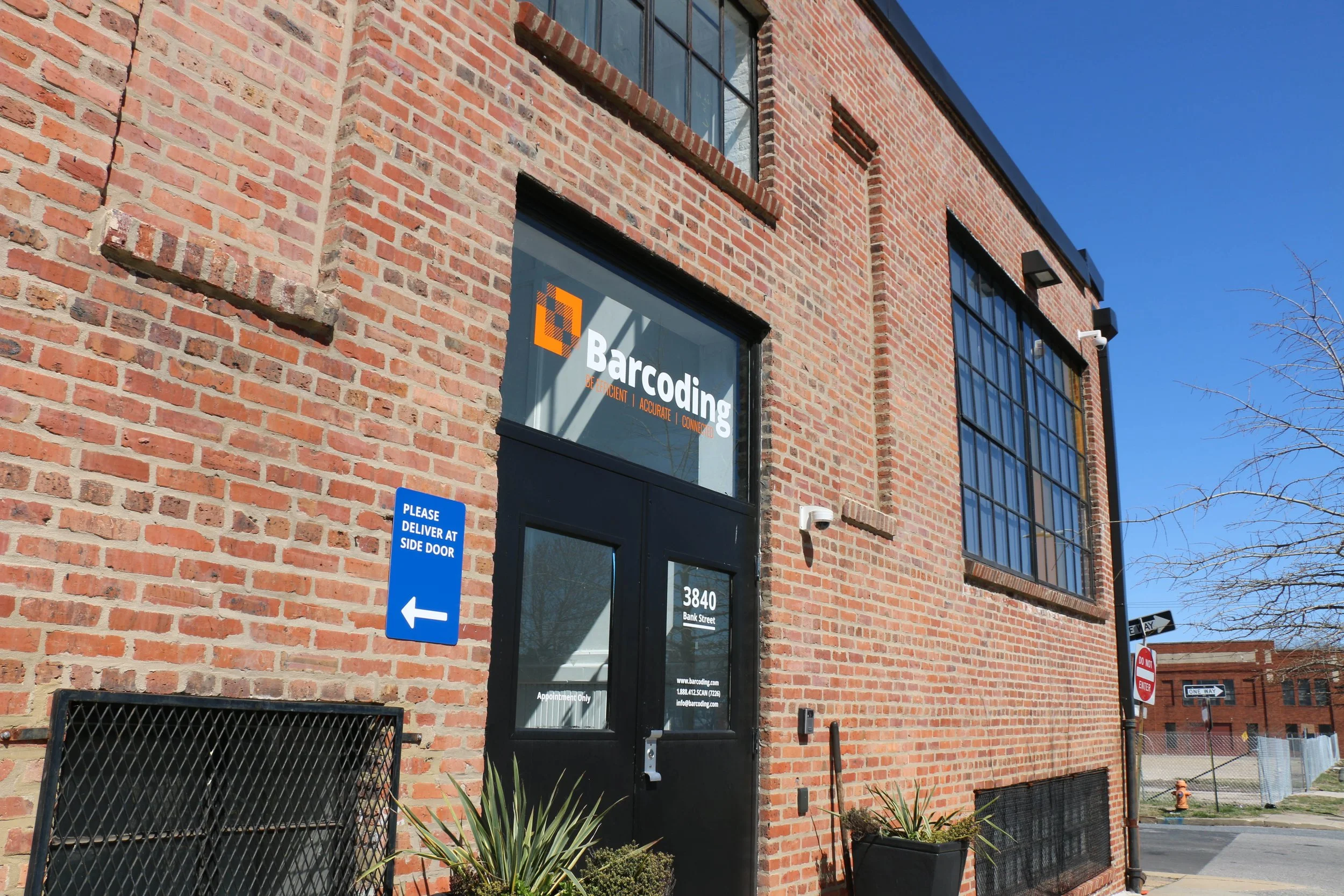
Our goal was to finish branding the building to ensure we have all the wayfinding necessary. We wanted to make sure employees, customers, delivery people, clients, and anyone visiting Barcoding knows where they need to go. And as a bonus, the signage also made spaces more inviting.
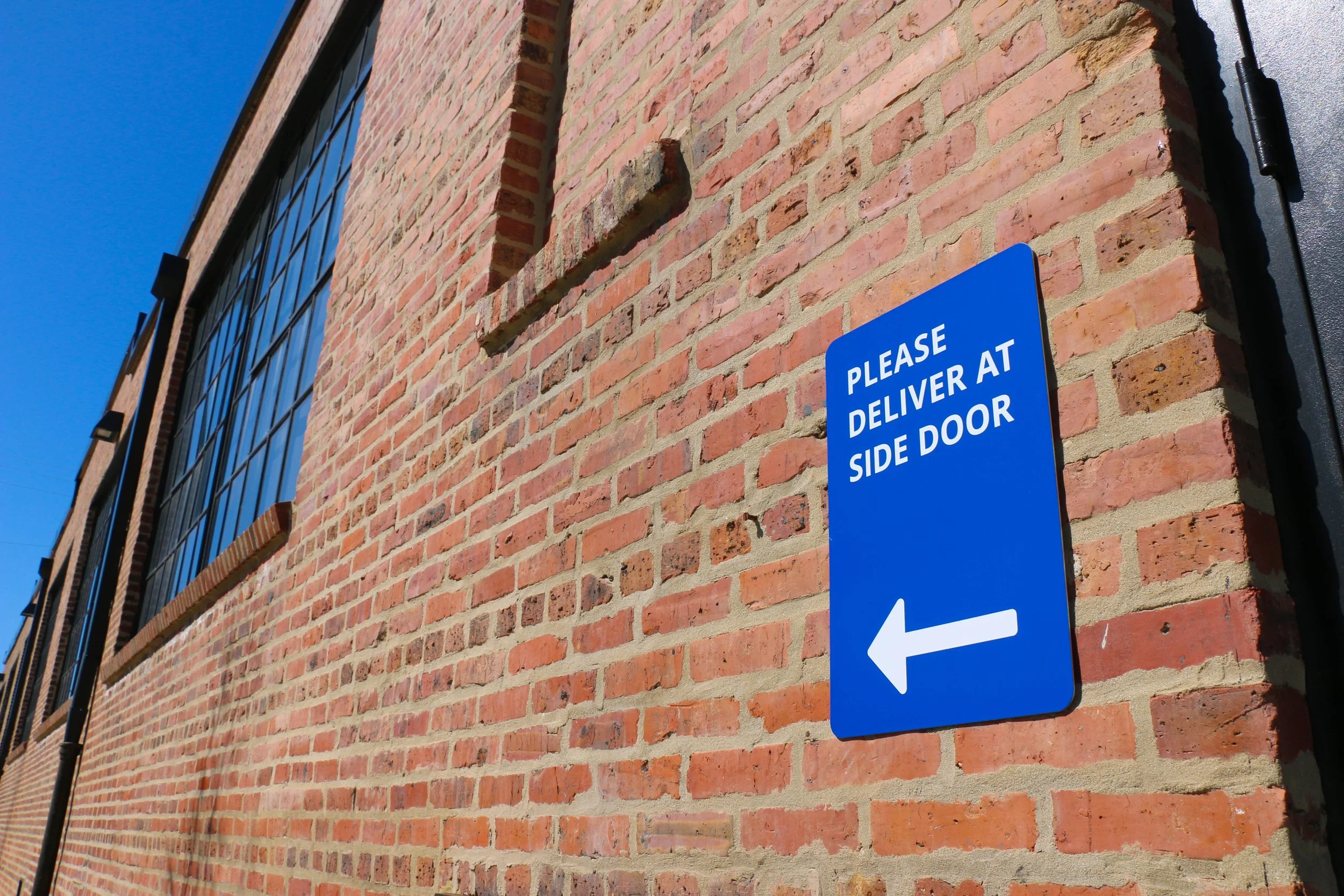
At the time, we were missing a lot of signage and wayfinding that would make things easier and more efficient. For example, when we had a UPS or FedEx delivery, some drivers would come to the lobby door instead of the back door.
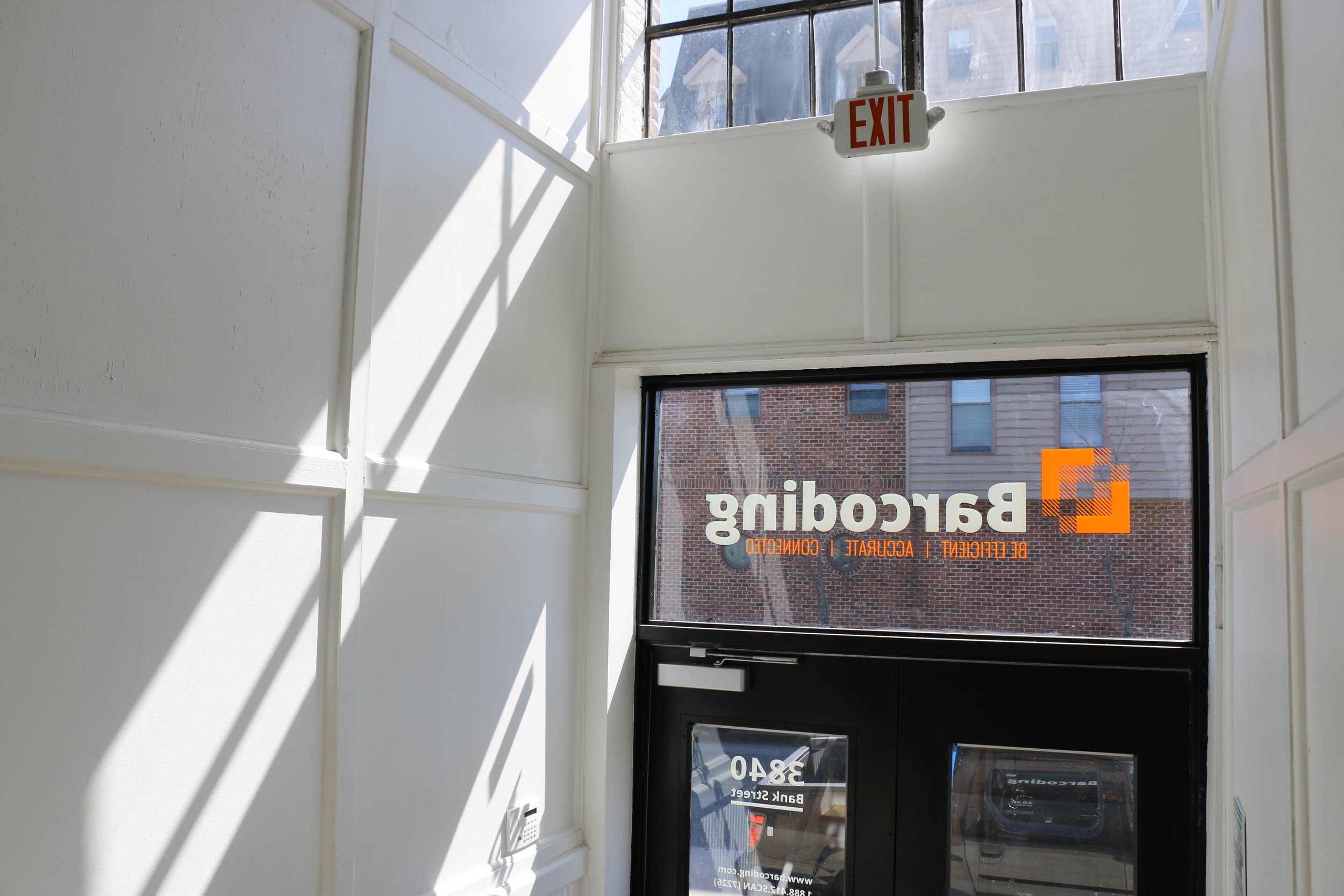
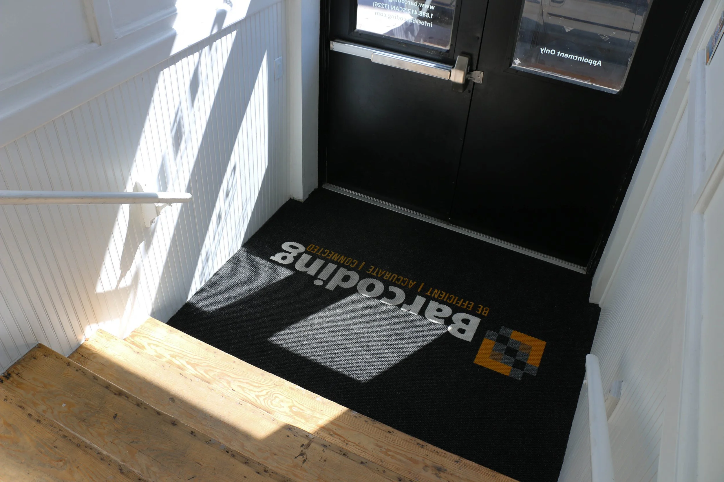
Installed delivery sign, logo vinyl, address/contact information vinyls
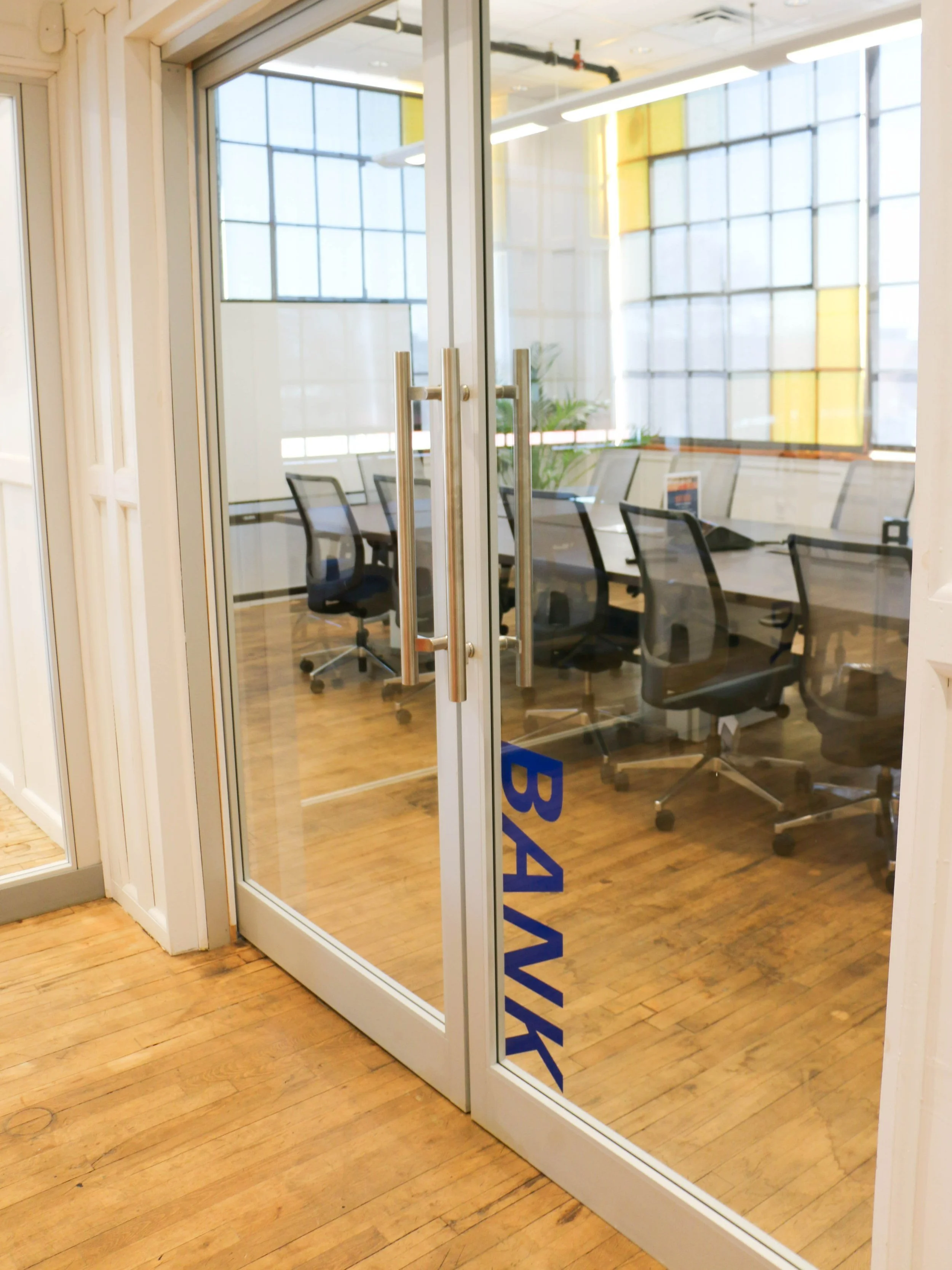
Conference Rooms
Using our brand typeface Open Sans, we designated spaces with larger wording. This helps newcomers find their way around and adds visual interest to the space.
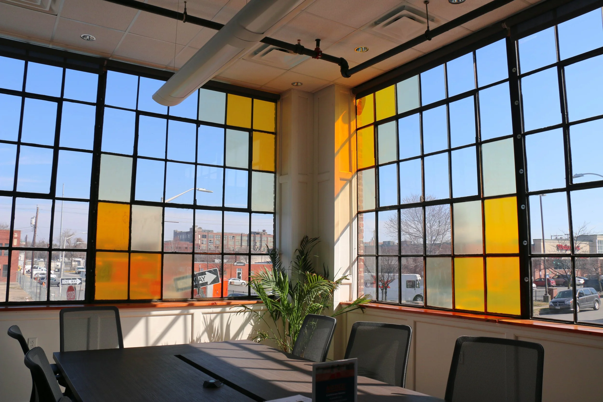
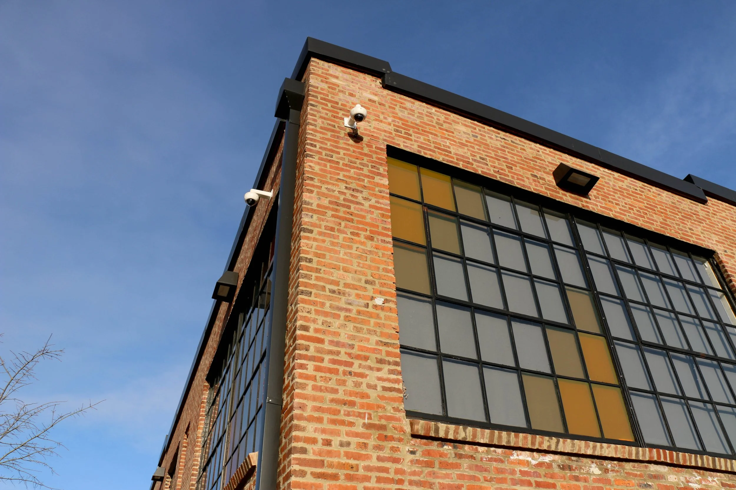
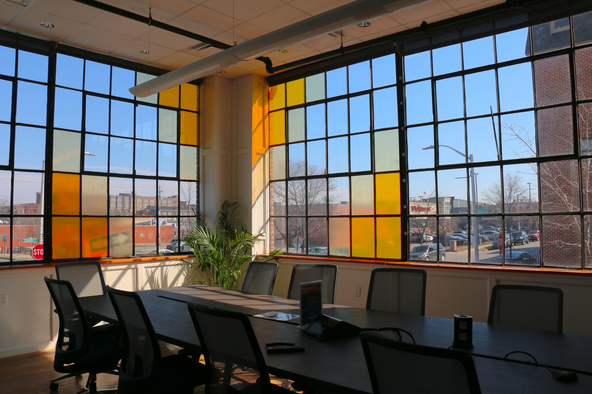
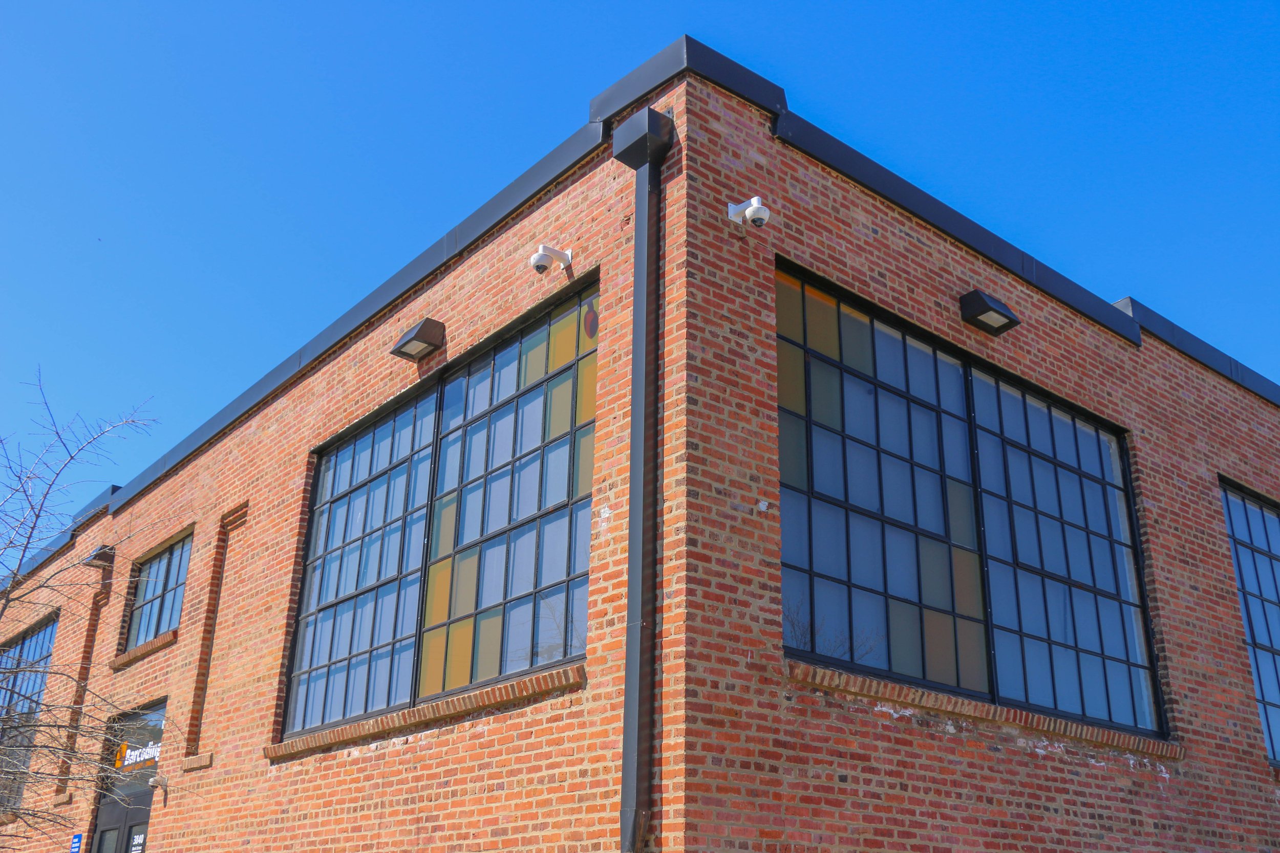
A fundamental element of our visual language is the orange square. It represents a piece of a larger whole; all pieces are important, and it is when they come together that magic happens. We took advantage of the large window panes to emulate the logo!
Installed window vinyls and conference room door signage
Continuous Improvement = Success
I’ve learned that the launch date is just the start of the rebranding process. The work that comes after is what determines success. By designing with our people at the center of our process, we ensured that the materials and messaging we developed meet their needs.
At Barcoding, we practice the same continuous improvement that we offer. No matter what part of the business operation we lead-in, it's crucial we turn that lens inward and create a solution that is adaptable and evolves to meet the needs of the people we serve.
Project Credits
Jody Costa, VP of Marketing
Jennifer Jericho, Brand Director
Josh Harding, Logo Design
Gregory Jericho, Motion Designer
Melina McLean, Designer/Marketer
“In Krystal’s time at Barcoding, she's been responsible for executing our new branding, educating internal teams on best practices, and communicating to leadership new projects and ideas. She also now leads all communications with our print and web vendors, requesting quotes, preparing files, updating budgets, and ensuring the final product is on-brand. I can't say enough how much I enjoy working with Krystal, she shows up every day with a fantastic attitude and is willing to take on new challenges to help our team stay efficient and award-winning!”


